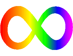
Why does the autism logo keep changing? & what is it?

Hi I thought I would start this thread because I am getting a tattoo of the autism logo, and on searching I found there are a few so which is the real logo? For many years it was the puzzle piece which I see most of, but the National autistic society logo is different and they sell pins and badges with the purple and pink logo on this site, then there is the autism awareness which is a ribbon with the puzzle piece pattern, IV seen butterflies, trees, and I’m a little lost, which is it? 

Parents
  • As far as I'm concerned, the autism symbol is an infinity sign in rainbow colours as seen at the top here: https://en.wikipedia.org/wiki/Autism_rights_movement

    The jigsaw puzzle piece idea is rejected by almost adult autistic advocates for several reasons, not least of which is that it became associated with Autism Speaks, as US organisation that is seen as regressive, stigmatising autistic adults and focussing on scare tactics to raise funds, and which has a blue jigsaw piece as a logo.  Blue is therefore also rejected as associated with autism.  The puzzle piece was originally designed in the 1960s by a parent because they were told autism was a psychiatric 'puzzle'. Autistic people didn't choose it themselves, and many find the idea of being a puzzle demeaning. The spectrum represents the wide variety of autistic or neurodiverse characteristics, and seems quite popular, although it could also be in the form of a heart or so on. I think infinity was meant to represent creativity, as well as retaining what was good about the ribbon.

    Other people can explain in more detail why NAS selected its logo. I'm fine with the current one and like the colours.

Reply
  • As far as I'm concerned, the autism symbol is an infinity sign in rainbow colours as seen at the top here: https://en.wikipedia.org/wiki/Autism_rights_movement

    The jigsaw puzzle piece idea is rejected by almost adult autistic advocates for several reasons, not least of which is that it became associated with Autism Speaks, as US organisation that is seen as regressive, stigmatising autistic adults and focussing on scare tactics to raise funds, and which has a blue jigsaw piece as a logo.  Blue is therefore also rejected as associated with autism.  The puzzle piece was originally designed in the 1960s by a parent because they were told autism was a psychiatric 'puzzle'. Autistic people didn't choose it themselves, and many find the idea of being a puzzle demeaning. The spectrum represents the wide variety of autistic or neurodiverse characteristics, and seems quite popular, although it could also be in the form of a heart or so on. I think infinity was meant to represent creativity, as well as retaining what was good about the ribbon.

    Other people can explain in more detail why NAS selected its logo. I'm fine with the current one and like the colours.

Children