War on Fonts!

Trump has told all government depts that they must go back to using Times New Roman fonts, rather than Calibri which was being used, I think this was brought in by Biden as so many people, have problems reading TNR.

Apart from the sheer ridiculousness of this, what is it about different fonts that exercises people so much? I've come across font purists before who go on about how some fonts are some kind of abomination, like comic sans. I like comic sans as a dyslexic person it's the easiest to read, but some people get in a real hissy about it, why?

  • I find comic sans readable as all the letter are well spaced apart and clear, it helps with being dyslexic and having an astigmatism, I often can't read words with to many uprights, words like little, I didn't realise how much of my reading was memorising a familiar blur rather than seeing the letters, until I was 42 and was diagnosed and given corrective lenses.

  • I'm reminded of this one.

    Along the same lines as use of commas to avoid ambiguity:

    "Proper capitalization is the difference between helping your Uncle Jack off a horse and helping your uncle jack off a horse."

  • I was originally taught that too, but then I learned that it can reduce the number of ‘ands’ in the one sentence.

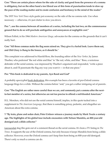
  • Some examples of the pros and cons of Oxford comma usage, republished in The Week.

  • Let me explain. The Oxford comma is used in certain sentences to make the meaning clear. 

    Here is one example.

    First a list which does not need the Oxford comma.

    I bought tea, coffee, sugar and salt.

    Now one where people can argue whether you need the comma or not.

    I bought tea, coffee, sugar, salt and fish and chips.

    I bought tea, coffee, sugar, salt, and fish and chips.

    Can you see the difference with the Oxford comma?

    If you use the Oxford comma correctly you can get extra marks in an English language exam.

    I was ungraded in my first two attempts at English language O level.

  • A lot of fonts are popular because people use whatever is the default one. People used to use Times New Roman regularly back in the day because it was the default option in a lot of Microsoft software. When they made the default Calibri, lots of people ended up using that. Similarly a lot of Office type software on Macs used Helvetica as the default. Windows did not include Helvetica though so you couldn't select it even if you wanted it.

    I've always quite liked serif fonts, although I predominantly use sans serif.

    I don't really have a favourite. I do rather have soft spots for Computer Modern and Prestige; both of which you won't find used much.

    I fail to see why Comic Sans is considered by some people as 'readable'. I find it quite annoying in large quantities.

  • I use a comma before 'and' at times. While always told it was incorrect, I think it can sometimes be appropriate as it reflects how you would actually say the sentence. 

    I don't worry about it. I suppose it depends on whether you think punctuation is there to increase meaning and aid communication, or a rules based game just for the hell of it to make school children's lives hard.

  • I have to say now you have explained that, I don't like the Oxford comma. I was taught that you 'never' put a comma before 'and' (....oh, no can't have a full stop after that word). It always feels wrong when I see a comma after that word, so it is news to me that intellectuals have decided that it is now correct. I guess as I am black and white I find things that don't follow the rules I was taught uncomfortable. 

  • Well I'll be contrarian, as normal.

    I grew up with Times font and always liked serif fonts. Perhaps I read broadsheet newspaper too much as a child. It was used a lot when I first started work too.

    I think Arial, Calibri and other sans serif fonts are easier to read but lack some aesthetic gravitas. Its a kind of optical dumbing down for the internet age.

    Gothic had a certain appeal but is not easy to read. It's a stylistic calligraphy thing.

    Nevertheless, the world has moved on, so it is probably best to just leave fancy fonts for more artistic applications.

  • I do use calibri as I thought it was readable, I didn't know it was specially designed to be so. 

    I want to say bad words now so I'll think I'll stop there.

  • Thanks Iain, I didn't understand any of that having only a tiny grasp of any grammar, my mind goes completely blank when people talk about it.

  • Whats an Oxford comma?

    The Oxford comma (also known as the serial comma or Harvard comma) is the use of a comma before the conjunction in a list of three or more items (e.g., the comma before “and” in “paints, brushes, and canvas”). The name comes from the fact that it’s recommended by Oxford University Press.

    source: www.scribbr.com/.../

  • Whats an Oxford comma?

    ****************

    I think they will take it as proof that you're some kind crazy or terrorist, I don't have a smart phone, but a flip top with no internet access, I think that would make me suspicious too, its what criminals use.

    Good job I have no intention of going to America, I'm pretty sure they wouldn't let me in.

    I agree that some fonts are, like Gothic are not easy to read and shouldn't be used for formal documents, but the others? If different fonts are all about diversity etc, then he's proving yet again that he's unfit for office. There I definately won't be allowed in now, any posts criticing Trump mean you will be denied entry.

  • Personally I am used to using Arial and change the font in most offline documents. I have been so used to using at work. I was not aware that Calibri was designed for that purpose.

    Every day is a school day!

  • I get that there may have to be rules about restricting the use of some of the more wacky fonts, but I think this is another of Trump’s moves against disabled people as Calibri was designed to be more readable on screens. Also, Calibri was considered to be more easily converted to audio than Times New Roman had been, but I don’t know if this still applies as technology has got more sophisticated. 

  • I didn't know there was such a thing as an acceptable font. Our letters at work use Arial because it is easy to read, but the emails use something else. I imagine the font on here might be Arial, but I wouldn't know how to change it.

    I have just reread your post and see it is government departments, which I missed the first time, thinking everyone had to use that and wondered what happened if you didn't. There seem to be so many rules there now. I believe that tourists will have to show their social media history before entering the country. I wonder what happens if you say you don't have any. Will it be like getting credit and they will refuse entry if you can't show any?

  • The world is a bit mad.  I remember Thérèse Coffey, the then health secretary, banning civil servants from using the Oxford comma because she didn't approve of it.