Some light redecorating

I took on a bit of a project with switching up my bedroom. I've replaced my TV with a new monitor, bought new speakers, threw out my armchair for an office chair. Next I'll be looking at tossing one of my two bookcases to make room for a desk (storage space, or floor space? Hmm...).

My process has been to make each step facilitate the next one, and to set myself deadlines by strategically ordering the new furniture so that I know what kind of timeline I have. I'm nowhere near done, but I've already been able to reclaim a lot of floor space. Incidentally, the desk I'm going to get will be an electric standing desk, so I have the flexibility of both standing or sitting whether I want to add a bit more exercise to my routine, or if I want more comfort.

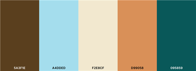
The next task ahead of me, after furniture, is that I want to colour coordinate my room better. I've had this rustic winter cabin in the woods thing kind of going on, but it was all rather slapdash with little thought of cohesion and harmony. This time around, I've been working on a colour palette. At the moment, my palette is Dark Walnut #5A3F1E, Non Photo Blue #A4DDED, Parchment #F2E8CF, Persian Orange #D99058, and Deep Sea Green #095859. The primary colour is Dark Walnut, covering two walls and being the general colour of all wood items I'm going for in a room with plenty of wood in it. The secondary is the Non Photo Blue, covering the other two walls. And the other three are accent colours. If anyone here has any experience with colour theory, I'd love to hear some input before I commit to buying anything in these colours.

My room doesn't recieve a ton of natural light, usually only getting direct sun during late afternoon in summer. So my plan is to use the Parchment and Persian Orange to brighten and help spread what light I can through the room, while the Deep Sea Green will be for more decorative items. I'm a novice when it comes to colour. But I like earthen, mediterranean colours, and am trying to go somewhat in that direction. I have a habit of getting carried away, so I'm trying not to over-design this space.

Anyway, this was just to share some productivity I've been engaging in, trying to keep a positive state of mind as I try to give my space more of an identity.

  • Don't forget texture when decorating a room, decoration dosen't begin and end with paint, often layering the colours you've chosen with cushions of the same tones but in different fabrics can add richness.

    I'm quite a fan of colour blocking, big areas of one colour from ceiling to skirting boards, I do quite like a light coloured ceiling though as I hate low ceilings or anything that makes them feel lower.

    What about beams, how do people feel about them? I'm not a fan, especially when they're dark, if they've been painted the same colour as the rest of the ceiling they're ok.

    The other things I don't like are exposed brick and stone work and huge massive windows. I think exposed brick and stone work make a house look unfinished and massive windows make me feel exposed. I really don't get why people want them in the bedroom? They'd be wasted on me as I'd just cover them up with blinds and curtains, but then I'm an owl and don't want to be awoken by the sun at the crack of sparrow fart.

  • I hadn't heard of that, but it sounds really interesting. I could use some wall lighting that doesn't need to be hardwired into the mains.

  • Have you seen those lamps that are magnetic and have a back plate on the wall? I saw them on Wales Home of the Year a couple of episodes ago and they looked really smart, like proper lamps, these were over a bed as reading lights and you could have them facing up or down.

  • I'm not a super big fan of light colours, but because of poor natural lighting, my darker colour choices have really had an impact. I am thinking about getting some lamps with smart lights, though.

    I'm trying to make the most of limited space. My bed alone takes up about a third of the room. After including the necessary furniture, what's left becomes really precious space.

  • The feeling I wanted to go for back then was being in a cabin in the woods, looking out into the forest. It kind of worked. But as time went by I realised how much of a problem it was that the dark wood tones absorbed so much light. Changing them is beyond what I'm willing to do with this project though, so I'm working around that to try to brighten things up.

  • Sometimes a dark coloured small room can look cosy, I don't think they should always be painted in light colours, he other mistake people often make is putting everything around the edges and having everything small, a well laid out room that you feel comfortable in and works for you is far more important. I would say pay attention to how you light the room, personally I find central ceiling lights really oppressive and prefer smaller lamps to give a softer more targeted light, maybe use a few mirrors too as the natural light is lacking.

  • The primary colour is Dark Walnut, covering two walls

    I'm sure you realise this but just in case - that will make the room darker and feel smaller.

    Personally, I only go for light colours - I have a lot of grey but it's not dark.

    Dark colours in a room can make it cosy but they can also be rather oppressive, probably depending on the room and the person in it.

    Just a thought.

    The persian orange doesn't look very orange to me actually, so seeing them all together, I think it looks good.

  • That's a good idea, if I can figure out how to do that.

  • May I suggest that you place thumbnails of those colours together here.

    Seeing them in unison is important.

    Also, for personal use, making an interior design moodboard would be useful - I bet nowadays you can do that online.

  • Well done.

    I looked up your colours.

    I love them all except the orange but that's just personal taste.

    Maybe share a photo with us when it's done.

    ps.  I'd not come across Color Hexa before - useful site.