Hello all.
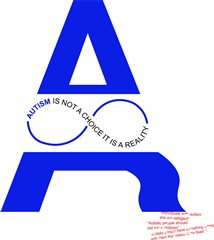
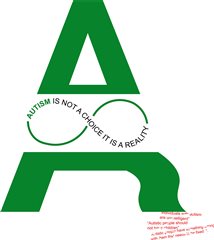
I am Daniel, a current member of the community and a graphic design degree student. A client has briefed me on a project, requiring me to choose a cause and use the power of text to make a difference, as part of a campaign. I decided to base my topic on challenging the negative stereotypes, shown in red. I am considering for one of these to be my poster for my campaign.
Do you think that the title is strong enough to challenge the negative stereotypes at the bottom of my design?
Do you prefer the design in blue or green?
Any font ideas?
Any feedback would be much appreciated. Thank you.