forum feature request

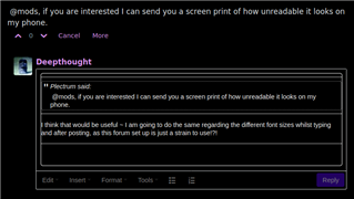
Can you please disable, or allow us to configure a setting to hide, all the formatting on forum posts?

Some people post in different fonts, different font sizes, use of bold, different colours or even a different background colour to their text. All of which jars terribly, makes their post inherently less readable and causes me enough distress at times that I just shut that browser tab leaving their post unread.

It feels odd that an autism discussion forum welcomes people creating visual noise. I have no interest in naming anybody, attacking anybody or making demands of them, I just want to be able to read the site without it upsetting me.

  • I think it should be borne in mind that some people might format their posts unusually because they need to (by all of us, the NAS included, that is - I'm not criticising the OPs request, which is perfectly reasonable, IMHO). For example, some dyslexic people find certain colour combinations or fonts make reading and writing much easier (even the much-derided Comic Sans font has been shown to be beneficial for some dyslexic people) - just as some of us might find their choices make the site more difficult for us to use. I personally find the shocking magenta colour scheme incredibly distracting due to my synaesthesia, and usually turn down the saturation on my monitor if I'm here for any length of time. Such conditions are more prevalent amongst autistic people, and to those who experience them, unusual styling is not merely "visual noise" or an annoying way to try to attract attention to their posts.

    I would prefer that the forum as a whole had a simple and prominent menu for selection of colour combinations, font, and font size/style - as the sites of many other disability-related organisations do (e.g. here at the Disability News Service). The built-in accessibility features of our gadget's operating systems can help, but often don't play nicely with sites that we'd like to use. The NAS really should be trying to set a good example for this kind of accessibility, IMHO, and it should have been made a higher priority when the site was redesigned a while back, rather than concentrating on superficial "rebranding", as seems to have been the case. As a site intended to be used by autistic people, it shouldn't be too much to ask that the site can be adapted to our sensory traits, and it could be made a shining example of best-practice for others to follow.

    PS) I haven't answered the poll, as I believe there should be a 3rd option - formatting should be displayed according to the preferences of each forum member.

  • I  have used a message from the Admin so that i don't breach anyone's privacy.  Here, BEHIND the date , you can see the faint grey text in an already tiny letter box shapedslit which I'm supposed to be able to scroll and read on my small phone. It's impossible.

    I used a message from admin, so i don't breach anyone's privacy. The actual text of the received message is the faint grey text hardly visible under the date. I circled it because you can hardly see it. The text appears in a tiny slit like a letter box, is too faint to read and the slit is only high enough for 1½ rows of text. the scrolling is not easy, so altogether it makes it impossible to use phone for PM-ing.


  •  @mods, if you are interested I can send you a screen print of how unreadable it looks on my phone. 

    I think that would be useful ~ I am going to do the same regarding the different font sizes whilst typing and after posting, as this forum set up is just an eye-strain to use!?!


  • it needs to be able to work on a mobile phone though - I already can't see any personal messages using the website on my phone. Please check mobile compatibility if you go forward with the font restriction. I only use the standard headline and body text anyway and so do the people I message.

     @mods, if you are interested I can send you a screen print of how unreadable it looks on my phone. 

  • Hi

    This formatting will happen when contributors post in text from other applications. As you'll know, if you write a message here, you can't do much more than bold, italics and a few heading sizes, for the reasons you state. We should be able to restrict it further on posting, but it would be good to hear from others as well.

    Anyone who accidentally pastes in formatting, and wants to remove it, should be able to use Format - Clear formatting on the editor menu.


  • Some people post in different fonts, different font sizes, use of bold, different colours or even a different background colour to their text. All of which jars terribly, makes their post inherently less readable and causes me enough distress at times that I just shut that browser tab leaving their post unread.

    It feels odd that an autism discussion forum welcomes people creating visual noise.


    I am not sure this forum welcomes people using different font sizes at least ~ as decreasing font sizes just 'happened' in my last two posts. Plus I have been waiting for micro text to stop being the standard feature of the reply window, and be twice the size like we see in the posted replies ~ @WebPM!?!